
A. The inspiration
Many of you will remember Mark Littlejohn’s recent talk to the Club on Zoom. He is an interesting character, and I enjoy reading his regular Facebook blogs about this and that, each accompanied by one of his beautiful landscape images. Recently, my attention was caught by this comment:
“All I’ve ever done is see something I like, point the camera at whatever the “something” is, and press the shutter release. There’s no technical skill. … Likewise ,my processing is rudimentary. … Yes, some of my pictures might have a painterly look but that doesn’t make me an artist. Thats just a combination of nice light and split toning.” Mark Littlejohn [sic]
Some members may already be familiar with the technique of split toning, whereas others may have rarely, if ever, used it. However, I hope that this Challenge will appeal in different ways, whether you are an experienced user of the technique or someone using it for the first time.
B. The Challenge
For this Challenge, you are asked to create up to five images, each created using the split toning technique. Your five images may show split toning applied to five different photographs, or you may decide to submit images where split toning has been applied differently to two or more of your photographs. The aim is to encourage you to experiment with the split toning technique and the different ways in which it can enhance an image or add a creative twist.
You may have some images that are well composed, but which you feel suffer from a lack of visual impact, or where perhaps the conditions, such as the weather or time of day, weren’t ideal. White balance corrections and editing for tones and contrast can help, but they may still not create the atmosphere you are looking for and could do with a bit more attention to add that magic ingredient required to evoke the scene, atmosphere and emotions you felt when you took the shot.
This is where the technique of split toning can help. It can turn a dull image into a spectacular one by adding emphasis to certain features and effectively enhancing natural light. It can create rich, dramatic skies or enhance the contrast between land and water. It can also correct white balance more selectively than standard colour temperature adjustments.
As well as creating atmospheric landscape images or enhancing portraits, you can also get really creative with it with minimal time and effort, choosing hues judiciously to achieve strong, artistic images. In the images of the cellist below, split toning has been used to achieve four different effects, from left to right: cold; warm ‘yesteryear’; vintage; and black-and-white.




C. What is split toning?
Split toning is an editing technique that applies one colour to the highlights and independently a different colour to the shadows, giving precise control over the colour palette and isolating the bright and dark areas of an image. It is a very simple idea and is easy to apply, yet it is extremely powerful; even making subtle changes can dramatically improve your images.
You can quickly and easily add drama or atmosphere to a photograph, completely changing the look of the shot. It can heighten colour interest and add colour depth to images, and it enables colour imbalances to be fixed and the emotional mood of images to be manipulated, allowing you to add your own personal creative style. And it can provide a simple way to create a series of photos all with the same look, each with your own unique stamp.

D. How does split toning work?
Split toning is possible in most editing software (for details, see blue section later). The main components are as follows:
- Highlight hue is the specific colour family you are choosing to add to the bright areas.
- Highlight saturation controls how intensely that colour is applied to the highlights.
- Shadow hue is the specific colour family you are choosing to add to the dark areas.
- Shadow saturation controls how intensely that colour is applied to the shadows.
- A balance slider, found in most editing software, shifts the threshold between highlights and shadows, determining which tone will dominate the image. Moving it toward highlights applies the highlight tint across more of the mid-tones, while moving it toward shadows does the reverse.
It is possible to tone just the highlights or just the shadows; there is no need to do both, and in some cases adding a little warmth to the highlights is all that is needed to bring life and depth to a shot.
If you use more recent versions of some image processing software, including Lightroom, you will find that ‘colour grading’ has replaced the ‘balance slider’. Colour grading uses 3-way colour wheels to allow manipulation of the highlights and shadows, and adds a third wheel, specifically to control the mid-tones.
Video: Super Serious Guides, How To Use Split Toning and Color Grading Wheels (2026 Easy Guide)
Although this video focuses on Adobe Lightroom Classic, the principles are equally relevant to all image processing software. It explains how to use split toning and colour grading wheels and covers shadows, mid-tones, highlights, balance, blending, and suggests the best workflow for natural colour grading.
E. Choosing colour combinations
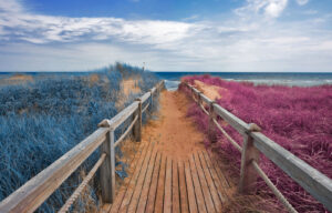
You’ll find some colours work better together, and it is common to choose colours on opposite sides of the colour wheel to create visually striking contrasts, such as teal and orange, yellow and blue or magenta and green. However, feel free to experiment and find what works well for you and your desired effect.
- Teal and Orange provide the classic cinematic Hollywood look. A warm orangey tone in the highlights and a cool blue in the shadows works well because they are complementary colours. Adding orange adds warmth to the highlights, which can preserve or enhance skin tones, while adding cool teal to the shadows creates colour separation.
- Yellow/Amber and Blue can be a great combination for landscapes or dramatic street photography. It mimics the natural contrast of sunlight during the golden hour against the deep shadows in the sky.
- Sepia and Deep Blue give a vintage look, with warm cream/yellow highlights set against deep blue shadows.
- Green/Cyan and Red/Magenta (cross-processing) is another possibility, with green/cyan added to the highlights and red/magenta to the shadows. This can give a stylised, moody, vintage look or an analogue film effect, and you can also use this combination to get an edgy, artistic finish.


Video: The School of Photography, Split Toning Lightroom
This short tutorial explains the split toning technique very simply and is well worth a look. It refers to an older version of Lightroom (before the change to ‘colour grading’), but it is short, and the concepts are applicable to any image processing software.
F. Split toning in black and white photography
Split Toning can be applied equally effectively to black-and-white as to colour photographs (see YouTube video below).
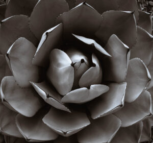
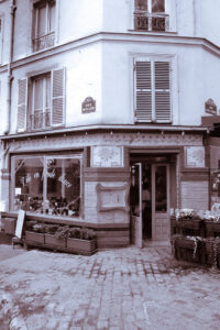
It suits black and white photography very well. It is a great way to add interest to your monochrome images; it adds dynamic depth and can give a standard monochrome image a more artistic look, such as with a sepia or selenium tone.

Despite the title, this tutorial has tips to help you add interest to black and white photographs. Again, it refers to an older version of Lightroom, but the ideas are the same.
Video 2: Paul Gallagher, Black and White Split Toning with Colour Grading
This video provides a clear explanation of how ‘colour grading’ works and why it can be an improvement over earlier split toning methods. The principles are applicable to both colour and black and white images.
G. Choosing images that are ideal for split toning or colour grading
Some photographs lend themselves to split toning more than others, although it is a technique that can be used to some degree on a wide range of images, from portraits to street scenes to landscapes.
Video: Mark Denney, Find Your Creative Style With SPLIT TONING
This video uses specific examples to show how three particular problems can be solved, while at the same time allowing you to add a touch of personal creativity.
H. How to achieve split toning using common processing software
Below, you will find some guidance relating to a number of commonly used software packages (apologies for any errors and omissions). At the end, there is some information about using Snapseed, should you wish to create your images on your mobile phone.
Guidance about processing is given in blue; simply skip to your preferred software package and ignore the rest (although some of the videos may still be of interest). Please then move on to the final sections, starting at ‘Section I. Tips and common mistakes to avoid’.
1. Adobe Lightroom & Camera Raw
After the 2020 Lightroom release, split toning has been integrated and expanded into the colour grading panel. You will see separate wheels for shadows, mid-tones, and highlights. You can drag the colour ‘pucks’ directly into the colours you want to achieve.
Find the Colour Grading panel.
-
- Select the Highlights wheel, choose a hue (e.g., gold), and drag outwards slightly to add saturation.
- Select the Shadows wheel, and choose a contrasting hue (e.g., navy blue), and adjust the saturation.
- Adjust the Blending and Balance sliders at the bottom to smooth out the transition.
Video: Super Serious Guides, How To Use Split Toning In Lightroom (2026 Easy Guide)
This video demonstrates how to use split toning/colour grading to create cinematic shadows and warm highlights. Follow the step-by-step guide to adjust hues, saturation, and balance.
2. Adobe Photoshop
Split toning in Photoshop can be done in various ways, including using colour balance adjustment layers, gradient maps, or the Camera Raw filter.
Method 1: Colour Balance adjustment layer
An adjustment layer offers the most localised control.
-
- Add Layer: Go to Layer > New Adjustment Layer > Colour Balance.
- Shadows: Select Shadows in the tone menu and shift the sliders towards your chosen colour, e.g., cool colours (add Blue or Cyan).
- Highlights: Switch the tone menu to Highlights and shift the sliders toward the opposite colour, e.g., warm colours (add Yellow or Red).
- Slightly adjust mid-tones if the transition feels too harsh, and the overall layer opacity if the colour cast needs adjusting.
Method 2: Gradient Map Adjustment Layer
-
- Add Map: Click the Create New Adjustment Layer icon and choose Gradient Map.
- Set Colours: Click the gradient bar to open the editor. Set the left (shadow) stop to a dark blue colour and the right (highlight) stop to a warm yellow or orange tone.
- Blend Mode: Change the adjustment layer’s blend mode from Normal to Soft Light or Colour, then lower the layer opacity to between 20% and 40% for a natural look.
Method 3: Camera Raw Filter Colour Grading
-
- Convert: Right-click your image layer and select Convert to Smart Object.
- Open Filter: Go to Filter > Camera Raw Filter.
- Colour Grading: Open the Colour Grading tab. Use the three wheels to dial distinct hues into the Shadows, Mid-tones, and Highlights, and adjust the luminance slider for fine control.
Video: Nemanja Sekulic, 5 Split toning techniques in Photoshop
This video is well worth watching if you are a Photoshop user. It demonstrates five distinct approaches for colour grading your images. Learn how to achieve complementary colours in highlights and shadows using curves, solid colour layers, and gradient maps.
3. Affinity
The dedicated split toning adjustment layer lets you pick individual hues and saturation levels for your highlights and shadows.
Applying the Split Toning Adjustment
-
- Open Adjustments: Go to the Layers panel, click the Adjustments icon, and select Split Toning (or navigate to Layer > New Adjustment Layer > Split Toning).
- Adjust Highlights: Set your preferred Highlights Hue (such as a warm yellow or orange) and drag the Highlights Saturation slider right to increase the colour intensity.
- Adjust Shadows: Choose a Shadows Hue (such as a cool blue or cyan) and increase the Shadows Saturation to tint the darker areas.
- Fine-tune Balance: Move the Balance slider left to emphasise highlight colours or right to emphasise shadow colours.
Video: Affinity Photo, Split Toning (Affinity Photo)
A short but useful video, demonstrating how to use Affinity Photo’s Split Toning adjustment, including for colour and black and white photography, It also explains how you can extend its usefulness with blend modes.
4. On1 Photo RAW 2026
The dedicated Split Tone filter in the Effects tab in ON1 Photo RAW 2026 allows you to tint highlights and shadows separately, adjust the colour balance, and fine-tune blending modes.
-
- Add the Filter: Open your photo in ON1 Photo RAW / Effects, click Add Filter, and choose Split Tone.
- Set Highlight Hue and Amount: Pick a colour for your bright areas using the Highlight Hue slider, then use the Highlight Amount slider to make the colour stronger or weaker.
- Set Shadow Hue and Amount: Pick a contrasting colour for your dark areas using the Shadow Hue slider and adjust the Shadow Amount slider.
- Adjust Balance: Move the Balance slider left to let the shadow colour take over more of the image, or right to give priority to the highlight colour.
- Change Blend Mode: Use the Mode dropdown at the bottom (default is Colour) to control how the tint mixes with your original photo.
Video 1: Creatively Enhance Photos with Split Toning, ON1 Photo Raw
This video explains how to create stylistic-looking images using split toning inside ON1 Photo RAW, including for both colour and black and white photographs.
Video 2: Creative Color Grading with the Split Tone Filter
This video demonstrates how to combine masking techniques with split toning to create stunning portraits using ON1 Photo RAW 2020.5.
5. Capture One
There are two main approaches to split toning in Capture One: the dedicated Split Tones tab within the Black and White tool for monochrome image editing, and the three-way Colour Balance tool (in later versions) for advanced colour grading across both colour and black and white workflows.
Method 1: Using the Dedicated Split Tones Tool (Monochrome)
-
- Access location: Go to the Colour tool tab and open the Black and White tool panel.
- Activation: Check the box for Enable Black and White
- Tab selection: Switch to the Split Tones sub-tab inside the panel.
- Adjustment: Use the Hue and Saturation sliders independently for both Highlights and Shadows to dial in your desired colour tints.
Method 2: Using the Colour Balance Tool
Access location: Found in the Colour tool tab as a 3-way colour wheel interface (shadows, mid-tones, highlights).
Workflow integration: It can be used directly on colour images or combined with an adjustment layer. For a pure split tone look on a black and white base, select your image layer, activate monochrome conversion, and manipulate the shadow/highlight wheels as required.
Video: The Art of Photography, Get Better Black and White Photos with Capture One
This video describes how Capture One allows you to apply tonal colours to both the highlights and shadows of black and white images.
6. Luminar
Split toning is handled via the Toning Tool under the Professional or Colour section, allowing you to colour grade your images by selecting individual hues and saturation levels for the highlights and shadows.
Using the Toning Tool
-
- Activate Amount: Push the main Amount slider up initially to clearly see your colour choices while editing.
- Highlights Tint: Choose a specific hue and increase the saturation to colourise the bright areas of your image (such as adding warm yellows or oranges).
- Shadows Tint: Choose a separate hue and saturation for the dark areas (such as cool blues or greens for a cinematic look).
- Balance Slider: Shift the balance slider left or right to dictate whether the highlight or shadow tone dominates the transition zones.
- Refine Saturation: Lower the saturation values down to a subtle level once you find your preferred balance.
Video: Jim Nix, Master Split Toning: 3 Tips and Tricks
This video includes three specific examples of how to use Luminar for split toning: (i) to improve the impact of a sunset image, (ii) to create a black and white vintage look, and (iii) to control the overall look of an image using colour shift.
7. Snapseed
Snapseed does not currently have a dedicated split toning slider or colour grading wheel, although there is talk of the next update including that feature.
However, split toning in Snapseed can be achieved using the Curves Tool to adjust individual colour channels.
-
- Open Curves: Open your photo in Snapseed, tap Tools, and select Curves.
- Access RGB Channels: Tap the Channel icon at the bottom middle (the small overlapping circles or line icon next to the eye) to switch from the master RGB curve to individual colour channels.
- Blue Channel (Blue/Yellow balance): Drag the left side (shadows) slightly up to add blue into the dark areas. Drag the right side (highlights) slightly down to push yellow/orange into the bright areas.
- Red Channel (Red/Cyan balance): Drag the left side (shadows) slightly down to pull red out of the shadows (adding cyan/teal) and lift the right side (highlights) slightly up to add warm red/orange tones to the bright spots.
- Green Channel (Green/Magenta balance): Leave the mid-tones stable or nudge the curve slightly up or down to neutralise unwanted colour casts.
- Save Your Edit: Tap the checkmark in the bottom right to apply the changes.
Video: Brent Hall, How To Split Tone Your Images In Snapseed
This tutorial demonstrates how to using the RGB curves tool to split tone your images in Snapseed.
I. Tips and common mistakes to avoid
It is best if you edit your images first in your usual way and then use Split Toning as a ‘finishing touch’, rather than as a stand-alone edit.
When selecting a colour, increasing saturation to 100% may help by giving you a clear idea of the effect, but you will then need to reduce it to an appropriate level, often below 10 – 15%, as over-saturating the tones can make a photograph look artificial.
Always make small changes first and check the effects. The best changes are often virtually invisible but can transform your image. As with any type of photo editing, be subtle and remember that ‘less is often more’.
Be careful with your mid-tones, as pushing the sliders too far will tint human skin tones green or blue.
J. The task
Please submit up to 5 images that demonstrate your use of split toning during processing. This can have been to make improvements to your photographs, or to create visually unique images. Enjoy experimenting and see what you can achieve. Your images will be shared in the usual way in a gallery on the website.
The deadline for submission is Wednesday 30 September. Hopefully, this will give plenty of time and the flexibility for everyone to have a go if they’d like to, especially given that it’s over the holiday season.
K. Submitting your images
Images should be prepared in the usual way (‘Title, Author’ as file name, taking care with accuracy; max. dimensions 1600 px wide or 1200 px high; max. file size 500 kb).
Please submit your images using the automated image upload system, under the category ‘Challenge #22: Split toning ‘. You will find a copy of the instructions for uploading HERE.
Acknowledgements
First, I would like to acknowledge Mark Littlejohn and his Facebook page for the initial inspiration for this Challenge: https://www.facebook.com/markljphotography
I also acknowledge, with thanks, the following articles and the use of AI, all of which provided invaluable information in writing this Challenge:
What is Split Toning and How to Use it in Lightroom? NORTHLANDSCAPES, Jan Erik Waider
The essentials of split toning photos, Photography News
How to Use Split Toning to Make Your Photos Stand Out, Pete DeMarco, Digital Photography School
Split toning in Lightroom, Jim Nix
Image credits:
I am also very grateful to the creators of the images they shared in this Challenge, and for making them freely available on Creative Commons. Here are the attributions for each image:
Cellist, cold tone, licensed under CC BY-SA 2.0; Cellist, yesteryear, gomagoti, licensed under CC BY-SA 2.0; Cellist, vintage, gomagoti, licensed under CC BY-SA 2.0; Cellist, gomagoti, licensed under CC BY-SA 2.0; Cellist, black and white, licensed under CC BY-SA 2.0.
Arches, v923z, licensed under CC BY 2.0; Camera, jawshouamoua, licensed CC BY-NC 2.0; Cat, Steve A Johnson, licensed as CC BY 2.0; Beach boardwalk, blue and pink, Nicolas Raymond, licensed under CC BY 2.0.
Megan, micadew, licensed under CC BY-SA 2.0.
Agave, macrophile, licensed under CC BY 2.0; The split tone, hyakushiki, licensed under CC BY 2.0; Split toned, Simon Hedge, licensed under CC BY 2.0.